

Not Out of the Woods
Has Bitcoin already absorbed the liquidity slowdown, or is it warning that the worst is still ahead?
Bitcoin may have broken first, but it has not yet given the all-clear. The Helios Global Liquidity Index reached a record $146.7 trillion on 28 July, yet its 12-month growth rate has slowed from +8.51% in March to +5.24%, while six-month growth has fallen to +1.03%. Bitcoin peaked in Q4 2025 and remained weak while the Nasdaq and Asia’s technology-heavy equity markets held up. Some of that divergence was clearly crypto-specific, but the macro backdrop has since moved in the same direction.
The more important warning is the combination now in place. Global-liquidity momentum is fading, the dollar has broken higher and the US 10-year real yield has cleared its prior one-year high. Comparable real-rate breakouts have historically widened the downside tail across Bitcoin and equities. The additional evidence from falling liquidity momentum is suggestive, not absolute. This does not tell us where Bitcoin will finish. It tells us that the path over the next months is a more treacherous one.
At the same time, the claims on liquidity continue to grow. Government borrowing and refinancing, investment-grade issuance and the AI capital-expenditure build-out are all competing for investor, dealer and bank balance-sheet capacity. Yet this is still active tightening rather than a system-wide liquidity crisis. MOVE, credit spreads and Treasury-market functioning have not confirmed broader stress. That is the awkward part of the setup: conditions are tight enough to force portfolio changes, but not yet disorderly enough to force a policy response.
This report therefore asks two questions. How much further downside should we be prepared for, and what would prove that Bitcoin has finally turned? The stress scenarios are deliberately severe, but they are not forecasts. A durable inflection requires Bitcoin to reclaim its 160-day trend filter, the weekly Trend Chameleon to leave its bearish regime, and relative trends against gold, the Nasdaq and the S&P 500 to confirm. If tightening eventually spreads far enough to destabilize funding or collateral markets, the policy response could end the liquidity drought and set up Bitcoin’s next phase of outperformance. Until then, we are not out of the woods.
Source PDF · page 3Key Findings
- Global liquidity remains near record levels, but its marginal impulse has weakened materially and the current cycle has entered a more mature phase.
- Bitcoin broke before broader equities. Crypto-specific damage explains part of that divergence, but the subsequent slowdown in liquidity momentum, stronger dollar and real-yield breakout make the warning harder to dismiss.
- The dollar is the first swing factor. A move into 105–106 is plausible; a sustained break above that area would increase the risk that tightening spreads into funding markets, credit and market volatility.
- The June real-yield breakout is economically meaningful. Comparable signals have widened the downside tail across Bitcoin and equities. The bearish footing is supported by falling liquidity-momentum.
- Debt refinancing, persistent sovereign issuance and the AI investment cycle are increasing the claims competing for investor demand and balance-sheet capacity. The issue is not one maturity cliff, but a system that is becoming more sensitive to any deterioration in market functioning.
- MOVE, credit spreads and market functioning remain the missing confirmation. Their relative calm means this a liquidity crisis, but moderate tightening can still produce a meaningful risk-asset sell-off.
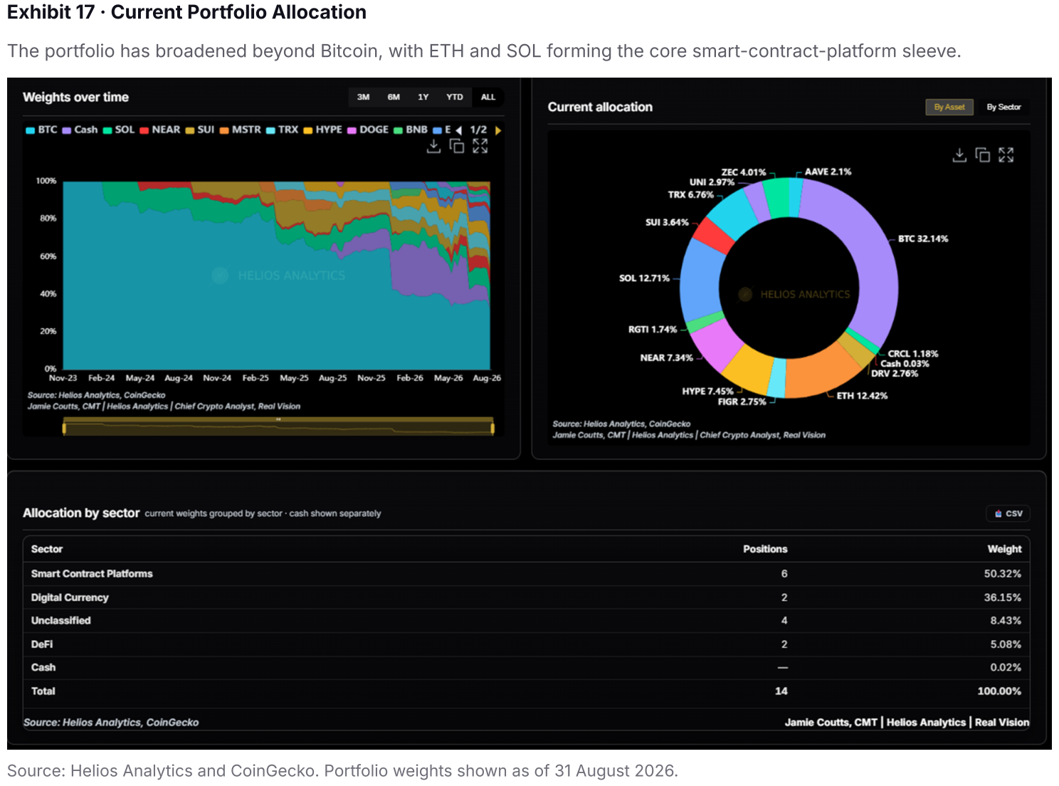
- The $42,700, $30,300 and $27,800 Bitcoin levels are stress scenarios derived from only two prior episodes, not forecasts. Even so, the wider evidence points to more downside risk and requires changes to the portfolio which has reduced the cash component to less than 9%.
- A durable Bitcoin inflection requires absolute confirmation: a reclaim of the 160-day trend filter, an improvement in the weekly Trend Chameleon and reversals against gold, the Nasdaq and the S&P 500. A later policy response would be the bridge from today’s drought to the next liquidity expansion.
1 · Bitcoin’s Warning Signal
Bitcoin Broke First. The Question Is Why.
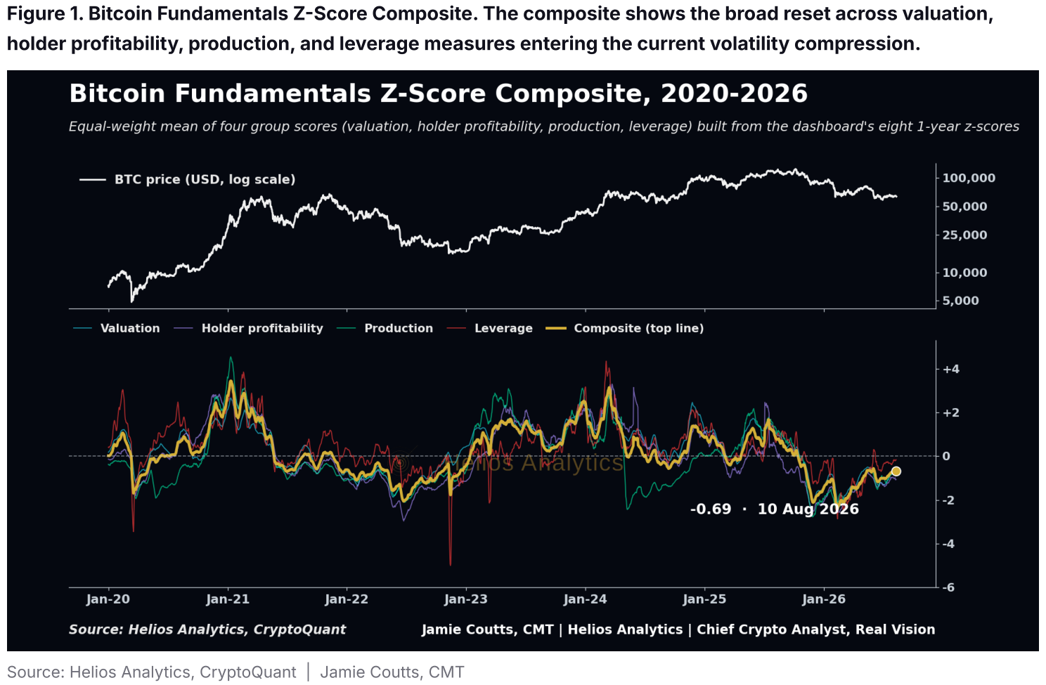
I underestimated the significance of Bitcoin’s Q4 2025 peak and initially treated the decline as a correction within the existing bull cycle. The sell-off into the February low produced genuine capitulation signals, but the recovery that followed failed to repair the broader trend. More importantly, it did not remove the macro risk. The liquidity cycle was already mature, and its marginal impulse has since begun to fade.
Bitcoin broke before equities in the two completed cycles most relevant to this report. The lead was approximately nine months in 2018 and only one to two months around the 2021–22 equity peak. The gap between Bitcoin’s Q4 2025 high and the latest equity highs is again close to nine months, although the current episode remains incomplete. This history provides no reliable forecasting window, but it shows that broad equity indices can remain resilient after Bitcoin has begun to weaken.
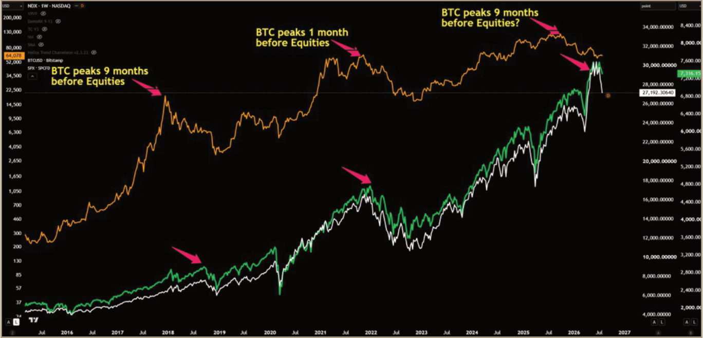
Exhibit 1 · Bitcoin Broke Before the Broader Risk Complex Source: TradingView; Helios Analytics.
Source PDF · page 5The current divergence has several explanations. The AI investment boom continued to support US growth and the tech-heavy Nasdaq, as hyperscalers and AI supply-chain companies reported strong earnings. Meanwhile, tightening US reserve conditions and the Binance deleveraging weighed more heavily on Bitcoin. Persistent selling pressure, weak crypto breadth and damaged relative strength across the Crypto Top 100 also show that much of the decline was crypto-specific.
The chart therefore does not prove that Bitcoin predicted the liquidity slowdown. Its relevance is that the more liquidity-sensitive asset weakened first, and the macro evidence has since moved in the same direction. Global liquidity momentum has slowed, the dollar has strengthened and real yields have broken higher. The question is whether Bitcoin has already absorbed that tightening or whether broader markets are only beginning to catch up.
2 · High Liquidity, Fading Impulse
The liquidity stock and the liquidity impulse are sending different messages. The Helios Global Liquidity Index directly aggregates US-dollar-converted central-bank balance sheets, broad money and selected FX reserves, less the US Treasury General Account and overnight reverse repos. It reached $146.7 trillion on 28 July, 42.3% above its pre-COVID peak, while 12-month growth slowed to +5.24%. The level remains exceptionally high, but the rate at which new liquidity is being added has deteriorated. The construction and signal definitions are set out in the Appendix.
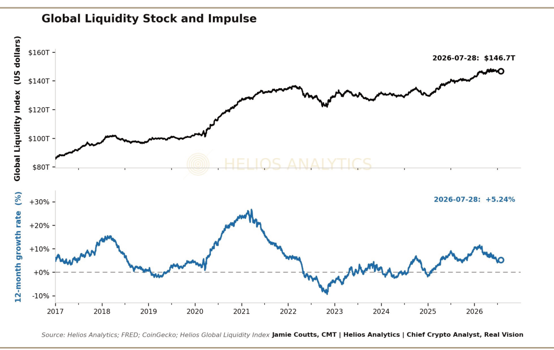
Exhibit 2 · Global Liquidity Is Near Record Highs While the Impulse Is Fading Source: Helios Analytics. Note: Darker shading marks periods when 12-month GLI growth is below its 41-month trend. The current phase remains above trend.
Source PDF · page 6The current deceleration began in March. Twelve-month growth has fallen by 3.27 percentage points from +8.51%, although the present phase remains 1.99 percentage points above its 41-month trend and is milder than the 2018 and 2021–22 contractions. Risk assets respond to the marginal change, which means conditions can become less supportive well before the liquidity stock falls outright.
The shape of this slowdown matters. It is currently much shallower than the fall into 2022 trough. If that slope persists, the 2018 cycle is a more useful base case for the current regime than a repeat of 2022, with liquidity growth slowing materially while the stock finds a higher floor. That remains conditional because a stronger dollar, higher real yields, or rising market stress (increased bond volatility) would steepen the decline.
The familiar liquidity overlay still provides useful cycle context for Bitcoin, although the lead has varied across cycles and its explanatory power has weakened materially in the current window.
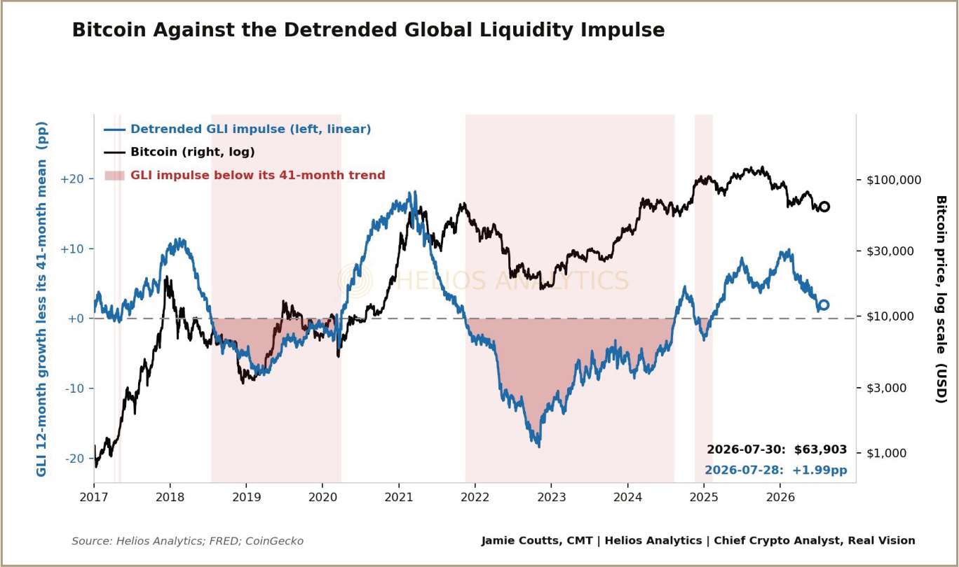
Exhibit 3 · Bitcoin and the Liquidity Impulse Source: Helios Analytics; CoinGecko. Note: The chart shows 12-month GLI growth detrended against its 41-month moving average. Values below zero indicate that annual growth is below trend.
Source PDF · page 7The overlay suggests that the impulse has room to weaken further. Liquidity growth is slowing, the cycle is mature, and the next several months appear less supportive than the headline level of $146.7 trillion implies.
The harder question is how far the 12-month growth rate could fall. The previous two tightening cycles provide a useful range. In 2018–19, global liquidity growth fell from approximately +11% to about -8% below trend over roughly 18 months. The decline coincided with a progressive tightening in US reserve conditions, leaving money markets vulnerable when corporate tax payments and a large Treasury settlement drained cash from the system in September 2019. US equities fell 20–25% and repo rates surged. The Federal Reserve responded with large repo operations followed by Treasury-bill purchases, expanding its balance sheet once again.
The lesson is relevant for Warsh. Powell was also a critic of QE. Central bankers may prefer a smaller balance sheet, but market plumbing ultimately determines how far that preference can be pursued.
The 2022–23 contraction was deeper after the excessive monetary response to the COVID calamity, with the 12-month rate of change in global liquidity falling to approximately -18% below trend. US equities fell by 25-35% this time. Higher rates and tighter liquidity also exposed accumulated duration losses and unstable funding structures across parts of the US banking system. Silicon Valley Bank and Signature Bank failed in March 2023, forcing the Federal Reserve to introduce the Bank Term Funding Program, or BTFP, which allowed eligible institutions to borrow against qualifying securities valued at par.
Both liquidity contractions lasted approximately 18 months from peak to trough. Bitcoin bottomed after roughly 12 months, around six months before global liquidity momentum began to turn higher, even though the broader liquidity cycle had not yet completed its decline. Bitcoin did not wait for liquidity conditions to become supportive again. It responded when the deterioration began to ease.
The current slowdown does not need to reproduce either historical extreme. Its gentler slope continues to favor a 2018-style deceleration as the base case, but a move towards zero would materially increase the probability that stress appears elsewhere in the financial system. I return to the potential pressure points and policy response in Section 8.
Source PDF · page 83 · Watching the Dollar and the Yield Curve
The US Dollar Index has broken above the 96–101 range that contained it through 2025 and early 2026. My technical work places 105–106 as the next important area, where the measured move meets descending resistance from the prior cycle highs. Reaching that zone would reinforce the liquidity slowdown. A sustained break above it would be more serious because the dollar is both a market price and a transmission channel for global financial conditions.
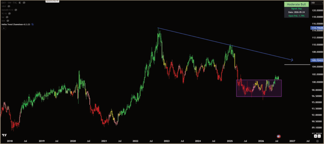
Exhibit 4 · The Dollar Has Broken Its Range and Points Towards 105–106 Source: TradingView; Helios Analytics. Note: The 105–106 area combines the measured range target with descending resistance from the prior cycle highs.
Positioning confirms that the market has changed. Speculative positioning reached an extreme short in Q3 2025, close to prior dollar-cycle lows in 2018 and 2021, and has since flipped net long. Previously, this ushered in a 12-month period of dollar strength.
Source PDF · page 9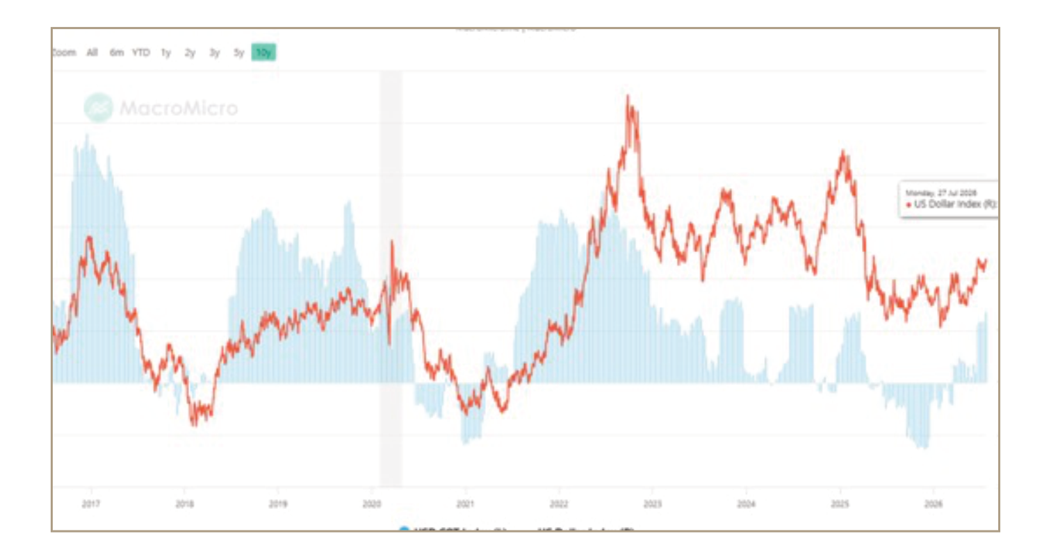
Exhibit 5 · Dollar Positioning Has Flipped From an Extreme Short to Net Long Source: MacroMicro; Helios Analytics.
A stronger dollar tightens global liquidity through two channels. It reduces the translated US-dollar value of foreign balance sheets, and it increases the local-currency burden of offshore dollar funding and debt service. The first channel affects the reported index mechanically; the second is genuine financial tightening.
The yield curve helps explain why this breakout is not simply a technical move. From 2 January to 29 July, the 2-year Treasury yield rose by 75 basis points, compared with 48 basis points for the 10-year. The conventional 2s10s spread therefore narrowed from 72 to 45 basis points. This is a bear flattener: yields rose across the curve, but the front end rose faster as markets priced a tighter policy path.
A flattening curve does not itself cause dollar strength. More often, both reflect the same monetary impulse. Hawkish policy repricing lifts front-end yields, supports the dollar and raises the cost of capital at the same time. That combination is more relevant for Bitcoin than the curve shape alone.
July has brought a short bear steepening as the long end has risen faster than the 2-year, but this is not yet an easing signal. It shows that pressure is migrating towards longer maturities. If that move is led by real yields, financial conditions can tighten through the discount rate even as the curve steepens.
Source PDF · page 10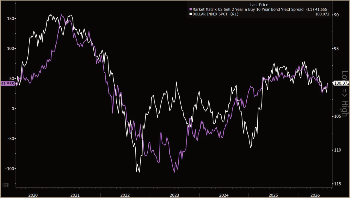
Exhibit 6 · Yield-Curve Flattening Has Coincided With Dollar Strength Source: Bloomberg; Helios Analytics. Note: Purple is the US Treasury 10-year minus 2-year yield spread. DXY is inverted, so a falling white line denotes dollar appreciation.
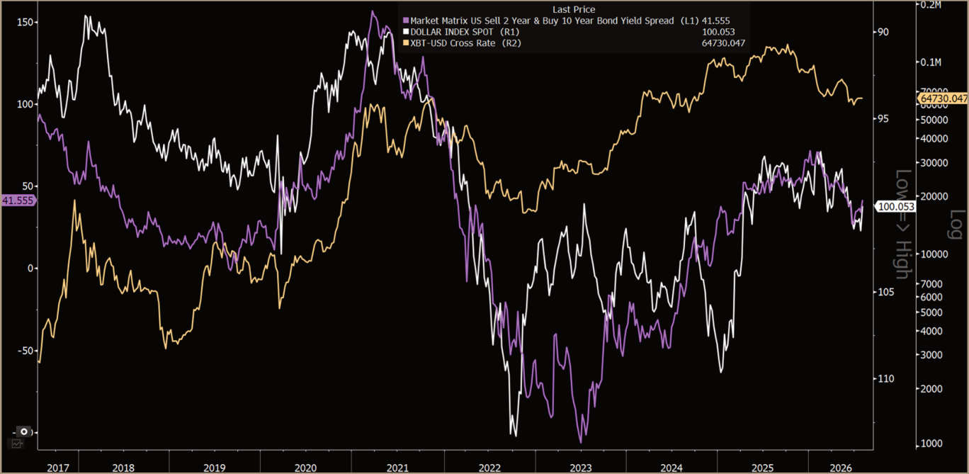
Exhibit 7 · Bitcoin Has Weakened as the Curve Flattened and the Dollar Strengthened Source: Bloomberg; Helios Analytics. Note: Purple is the US Treasury 10-year minus 2-year yield spread; white is inverted DXY; orange is Bitcoin on a logarithmic scale.
Source PDF · page 11The visual relationship is persuasive, but history rejects the simple claim that flattening is automatically bearish for Bitcoin. Monthly flattening on its own produced positive median Bitcoin returns. The outcomes deteriorated only when the move persisted as a bear flattener and coincided with a stronger dollar.
Table 1 · The 2026 Tightening Configuration
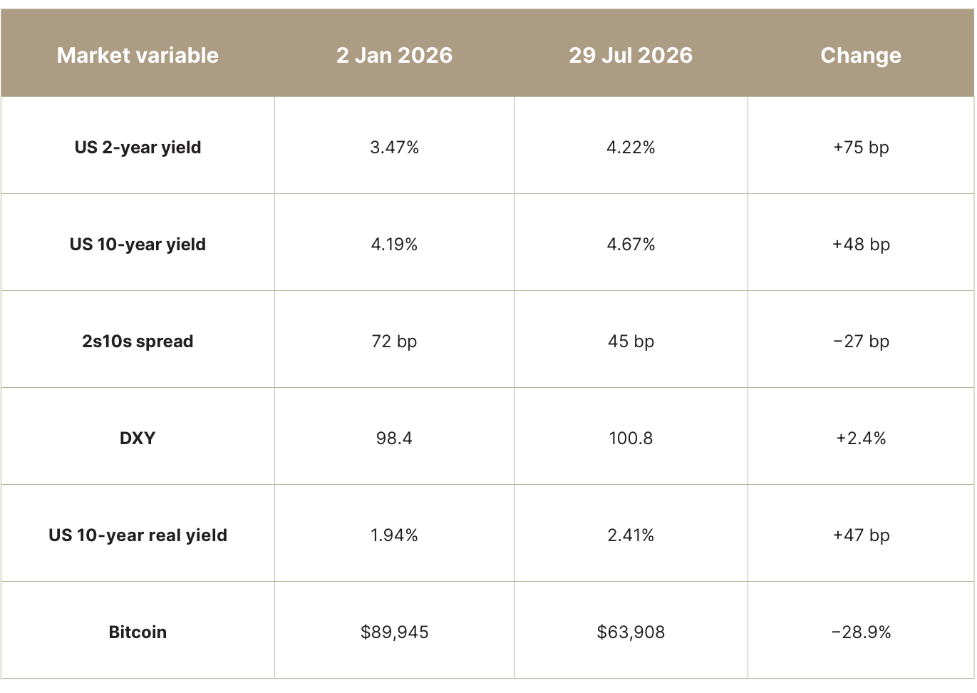
Source: Helios Analytics; FRED; Yahoo Finance. Note: Changes use the first available observation on or after 2 January and the latest common observation on 29 July 2026.
The event study makes that distinction explicit. A signal is classified as a persistent bear flattener when both Treasury yields rise over three months and the 2-year rises faster than the 10-year. The downside hit rate is the share of completed observations in which Bitcoin’s return was negative.
Source PDF · page 12Table 2 · Bitcoin Outcomes During Yield-Curve Tightening Regimes
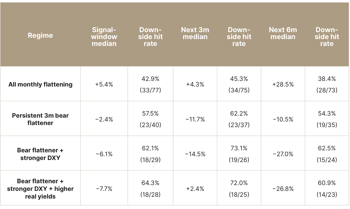
Source: Helios Analytics; FRED; Yahoo Finance. Note: Month-end observations from September 2014 to July 2026. The first row uses one-month flattening; the remaining rows use three-month changes. Monthly signals overlap, so they are not independent. Hit rate equals the proportion of negative Bitcoin returns; denominators vary because later forward windows are incomplete.
The overlap is important. After consolidating the strictest configuration into ten distinct episodes, Bitcoin’s median subsequent three-month return was −8.6%, with a negative return in seven cases. The six-month median was −10.5%, with a negative return in five of nine completed episodes. The evidence is suggestive, not a forecasting rule: the sample is small and concentrated around a few tightening cycles.
The curve should therefore be treated as confirmation of the tightening regime, not as a standalone Bitcoin signal. A stronger dollar, rising front-end yields and higher real rates all make marginal liquidity more expensive. Bitcoin is particularly exposed because it trades as the highest-beta expression of that liquidity.
The curve tells us where the pressure is moving. Real yields tell us how much the discount rate has increased. On that measure, the more important signal has already fired.
Source PDF · page 134 · Real Yields Raise the Stakes
Global liquidity is still expanding, but its momentum is fading just as the real return available on US government debt has broken higher. These are separate pressures. One slows the marginal flow of capital into asset markets, while the other raises the return that Bitcoin and equities must offer to compete for it.
The US 10-year real yield broke above its prior one-year high on 8 June at 2.21% and reached 2.41% by 28 July, its highest level since real yields peaked in 2023.
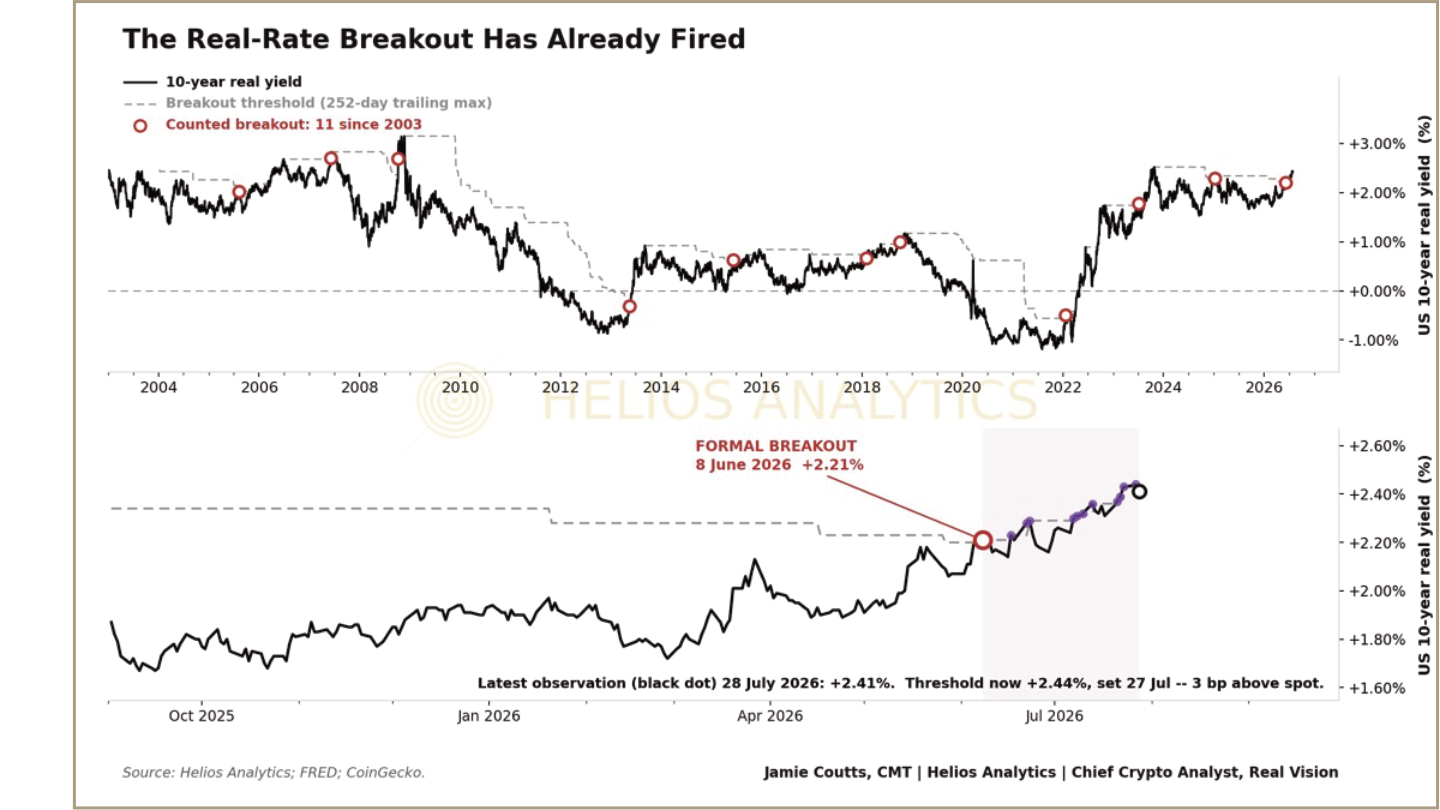
Exhibit 8 · The Real-Rate Breakout Has Already Fired Source: Helios Analytics; FRED. Note: A breakout is the first close above the prior 252-trading-day high, provided no qualifying signal occurred in the previous 120 calendar days. The formal signal occurred on 8 June 2026.
Source PDF · page 14The Signal Changes the Downside Distribution
A real-rate breakout does not tell us where Bitcoin will finish after three, six or twelve months. It tells us that the path has historically become more dangerous. The study measures the worst cumulative return from the event-date close over each forward window. In plain English, it asks how much pain an investor buying at the signal would have faced before the window ended.
Adverse outcomes were deeper after real-yield breakouts across all nine asset-and-horizon comparisons. Bitcoin’s median worst return deteriorated from -23.5% at three months to -50.7% at twelve months, compared with -14.0% and -20.1% from ordinary calendar month-starts.
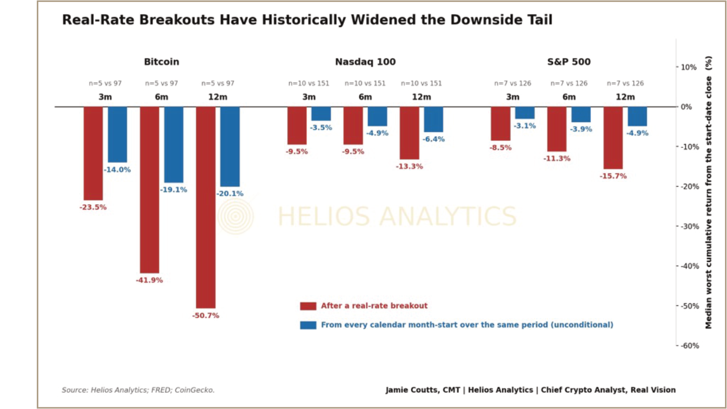
Exhibit 9 · Real-Rate Breakouts Have Historically Widened the Downside Tail Median worst cumulative return from the start-date close over the following three, six and twelve months. Source: Helios Analytics; FRED; CoinGecko. Note: The measure is the worst cumulative return from the event-date close, not a peak-to-trough maximum drawdown or terminal return. The benchmark uses every calendar month-start over the same available history. Breakout samples comprise five completed Bitcoin observations, ten Nasdaq 100 observations and seven S&P 500 observations. The eleven rate signals fall into six broader macro episodes, so the observations are not fully independent.
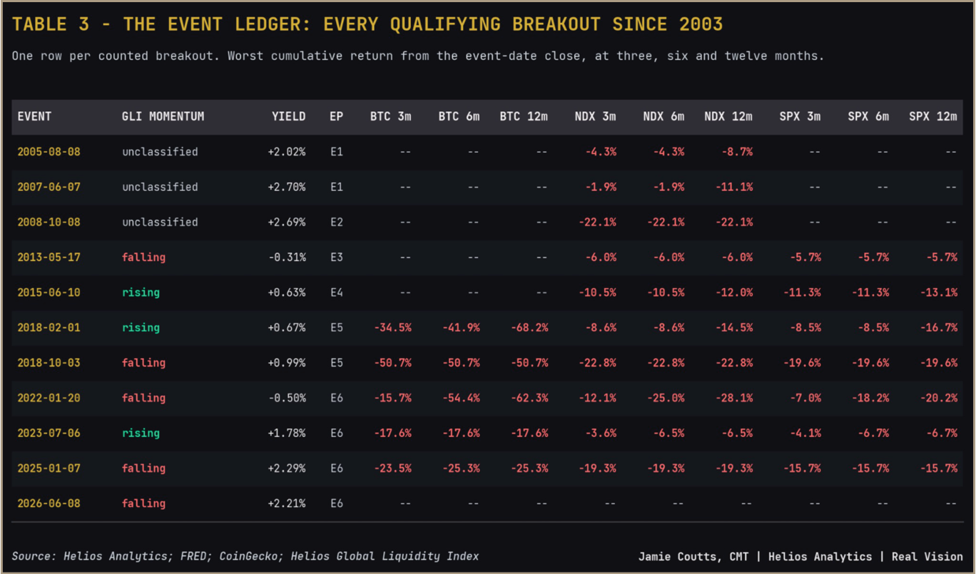
Source PDF · page 15However, the horizons are nested, the equity indices are correlated and the signals cluster into six broader episodes. This is one consistent pattern across related comparisons, not nine independent confirmations. The result also survives consolidation of the eleven signals into six broader macro episodes, reducing the risk that closely spaced breakouts count the same drawdown repeatedly. The complete event ledger and consolidation rules are provided in the appendix.
Falling Momentum Makes the Breakout More Dangerous
The current real-rate breakout occurred while liquidity momentum was already fading, which makes this episode more concerning. When previous breakouts are separated by the direction of the Helios Global Liquidity Index impulse, adverse moves were deeper when momentum was falling in eight of the nine asset and horizon comparisons.
Bitcoin’s three-month result was the only exception. Its median worst return was -23.5% when liquidity momentum was falling, compared with -26.0% when momentum was rising. The difference became much clearer over longer periods. The six-month result deteriorated from -29.7% to -50.7%, while the twelve-month result worsened from -42.9% to -50.7%.
The momentum split is less robust than the breakout result itself. Using a 60-day rather than 91-day momentum window reclassifies one event and reduces the result from eight of nine comparisons to five of nine. Falling momentum should therefore be treated as contextual evidence, not an independently robust signal.
Source PDF · page 16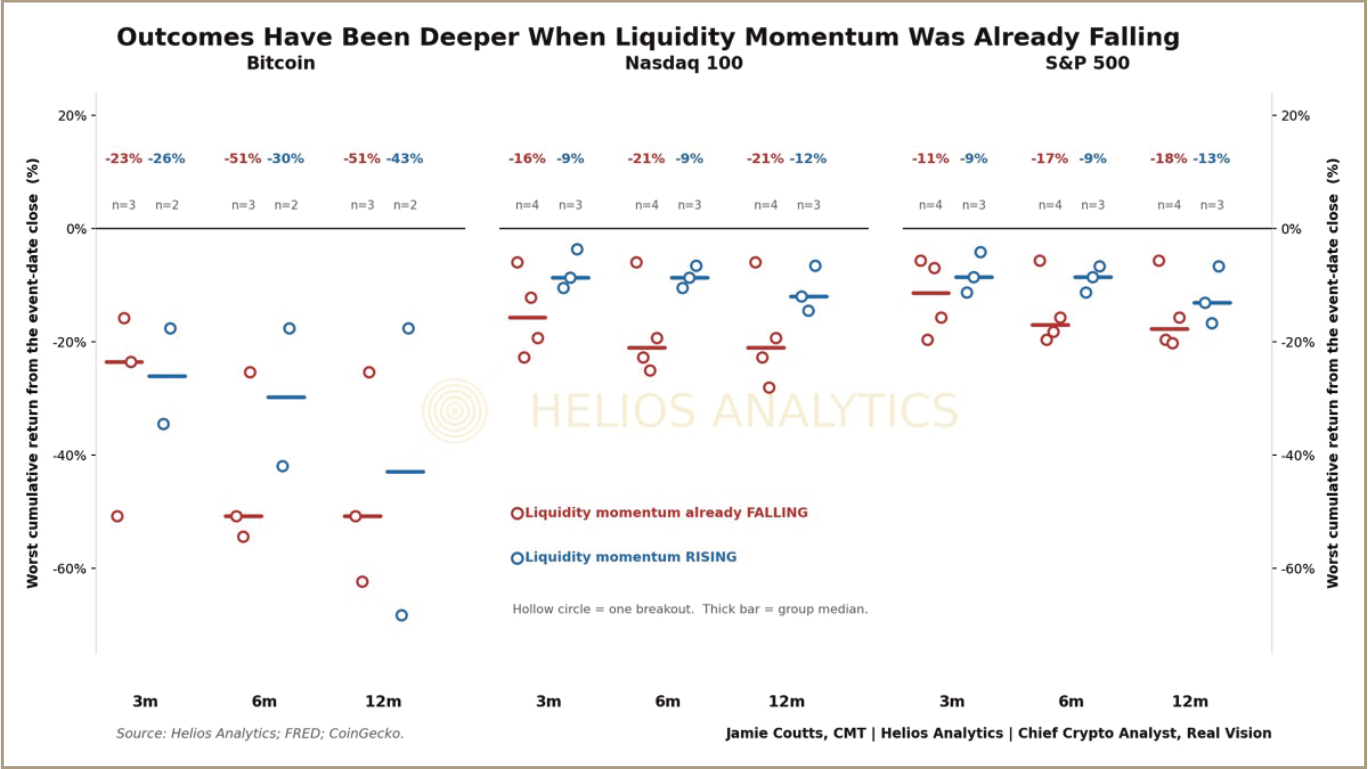
Exhibit 10 · Downside Has Been Deeper When Liquidity Momentum Was Already Falling Source: Helios Analytics; FRED; CoinGecko. Note: Momentum is falling when the 91-day change in detrended 12-month global-liquidity growth is negative. The split contains only three falling-momentum and two rising-momentum Bitcoin observations, and three to four observations per group for equities. Treat the result as descriptive.
Bitcoin Has Been More Vulnerable Than Equities
Today’s liquidity backdrop reinforces that warning. Global-liquidity growth remains above its 41-month trend, but its 91-day momentum is falling. Since 2012, Bitcoin has suffered substantially deeper drawdowns in this regime, while outcomes for the Nasdaq 100 and S&P 500 have remained broadly in line with their historical norms.
Source PDF · page 17Table 3 · Bitcoin and DXY During Today’s Liquidity Configuration
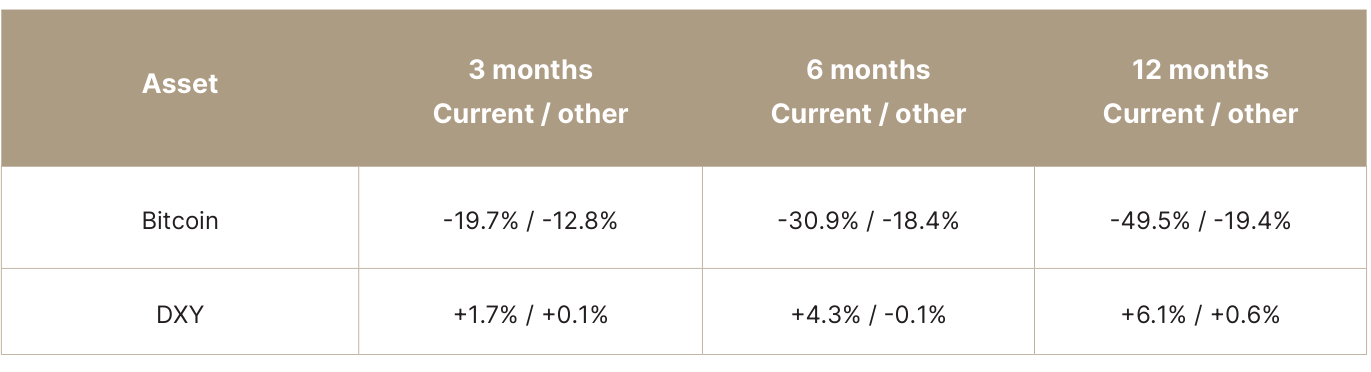
Source: Helios Analytics; FRED; CoinGecko. Note: ‘Current’ means 12-month global-liquidity growth is above its 41-month trend while its 91-day momentum is falling. Results use overlapping calendar month-starts from 2012, so the effective number of independent episodes is much smaller than the monthly observation count.
Bitcoin’s median worst twelve-month return in this regime was -49.5%, compared with -19.4% during other periods, while DXY typically strengthened. By contrast, neither the Nasdaq 100 nor the S&P 500 experienced deeper-than-normal drawdowns under the same liquidity conditions.
This supports the report’s broader argument that tightening can become visible in Bitcoin before comparable stress appears in the major equity indices.
These results need to be interpreted separately from the real-rate event study. Table 3 isolates today’s liquidity configuration; it does not test the combined effect of falling liquidity momentum and a real-rate breakout. Both conditions are now present, but the historical analysis does not provide enough joint observations to treat their interaction as a precise forecasting model.
What the Combined Signal Means
The event study found no consistent tendency for gl obal liquidity to weaken after real yields broke higher. The two pressures should therefore be treated as independent. They have now converged: the liquidity impulse is fading just as rising real yields have increased the return available on safer assets.
This does not identify a market top or forecast where Bitcoin will trade over the next year. It shows that the downside distribution has historically worsened after real-rate breakouts. The liquidity-momentum split adds context, but is not robust enough to provide independent confirmation.
That is sufficient to justify some portfolio adjustment. I intend to review position sizes and risk concentration, trim selected exposures and raise a modest amount of cash. If weakening liquidity and higher real rates produce the deeper drawdowns seen in previous episodes, that cash will provide flexibility to rebuild positions at lower prices.
The signal is one of deteriorating risk-reward, not an imminent crisis: liquidity support is fading, the hurdle rate has risen and balance-sheet capacity is becoming more contested. That is a less supportive backdrop for Bitcoin than the headline level of global liquidity implies.
Source PDF · page 185 · More Claims Are Competing for Balance-Sheet Capacity
The debt maturity wall has become an important part of the liquidity debate. Many including Michael Howell’s work at Global Liquidity Indexes points to a sharp increase in the annual debt roll across advanced economies from 2025, with refinancing demands remaining elevated through the remainder of the decade. I have had varied success from reproducing this data series from public data, so I will use Howell’s here and as a directional warning rather than evidence of a precise maturity cliff. Gross refinancing is not equivalent to new financing, but it can increase sensitivity to funding costs, investor demand and balance-sheet constraints.
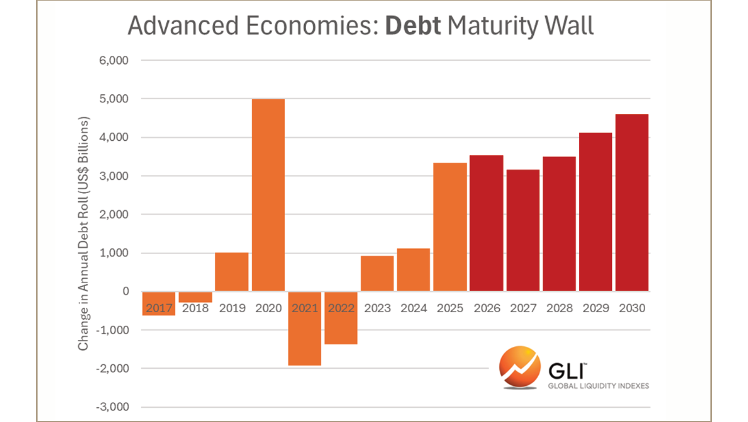
Exhibit 11 · Advanced Economies: Debt Maturity Wall Source: Global Liquidity Indexes. Note: The chart estimates the annual debt roll across advanced economies. It is not a US Treasury maturity schedule and has not been independently reproduced by Helios Analytics. Gross refinancing should not be interpreted as an equivalent amount of new financing.
Source PDF · page 19The broader issue is not simply how much debt is maturing, but how rapidly the stock of claims is expanding while the liquidity impulse is weakening. Over the period shown below, US public debt increased substantially faster than the commonly used US net-liquidity proxy of Federal Reserve assets less the Treasury General Account and reverse-repo balances.
Over the five years to 22 July 2026, US total public debt compounded at 6.84% a year. Global liquidity increased by 2.15% a year, while the US net-liquidity proxy contracted at an annual rate of 3.04%. The divergence is notable, but it does not by itself establish a financing shortfall.
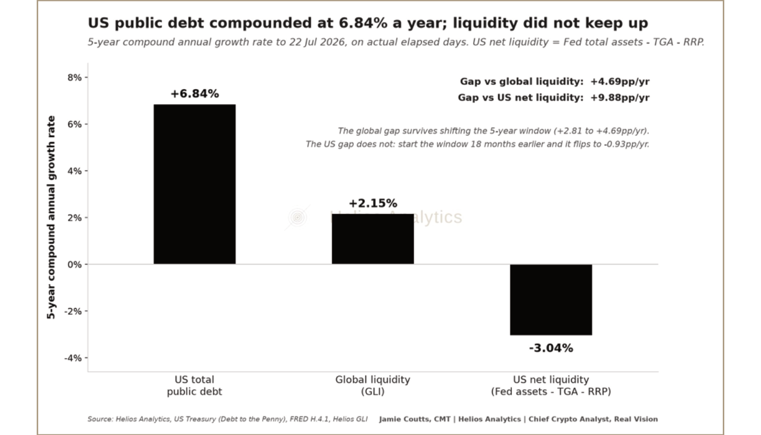
Exhibit 12 · US Debt Growth Has Outpaced the Net-Liquidity Proxy Source: Helios Analytics; US Treasury; Federal Reserve. Note: Five-year compound annual growth rates to 22 July 2026, calculated using actual elapsed days. US public debt includes intragovernmental holdings and therefore overstates the securities private investors must absorb. US net liquidity is defined as Federal Reserve total assets less the Treasury General Account and reverse repos. It is a market-liquidity proxy, not a measure of total financing capacity. The comparison is sensitive to its starting date because of the unusually large pandemic-era movements in the Federal Reserve balance sheet, the TGA and reverse repos. The chart illustrates a divergence between the series; it does not establish a mechanical debt-to-liquidity requirement or prove that Treasury supply cannot be absorbed.
Source PDF · page 20The divergence is still relevant, but its meaning is narrower than the chart may initially suggest. Debt and net liquidity do not need to grow at the same rate, and the two series are not directly comparable pools. What the chart does show is that the stock of government liabilities has continued to expand while this measure of marginal liquidity support has not. Combined with larger refinancing volumes and persistent fiscal deficits, that increases the importance of investor demand, dealer balance sheets and funding-market capacity.
The AI build-out adds another source of demand for capital. Hyperscaler investment is accelerating, investment-grade issuance is increasing and debt financing is playing a larger role in funding the required infrastructure. This does not imply a fixed pool of capital, but it adds more high-quality claims competing for investor demand at a time when liquidity momentum is fading and real yields are rising.
The issue is therefore not a single maturity wall or a mechanical shortage of liquidity. It is the convergence of larger refinancing volumes, continuing net sovereign issuance and rising corporate capital requirements while the liquidity impulse is slowing. That combination leaves the system more sensitive to rising yields, a stronger dollar and any deterioration in market functioning.
None of this demonstrates that markets are currently struggling to absorb the supply. Treasury volatility, credit spreads and funding markets remain comparatively orderly. The vulnerability lies in the direction of travel: if market depth deteriorates and funding stress begins to emerge, the growing financing burden will become materially more consequential.
A more rigorous comparison using privately held marketable Treasury debt, net issuance and observable absorption measures is an area for further work. For now, the correct conclusion is narrower: the burden is increasing, but the stress indicators in the next section have not yet confirmed a system-wide liquidity event.
Source PDF · page 216 · MOVE Index Is the Missing Confirmation
The strongest counter-thesis is visible in the stress data. MOVE remains subdued, credit spreads have not widened decisively, and Treasury markets continue to function. Those conditions weaken the case for an imminent crisis even though DXY and real yields are already tightening financial conditions. The same was true through much of the 2018–20 slowdown: bond volatility did not become problematic until the COVID shock.
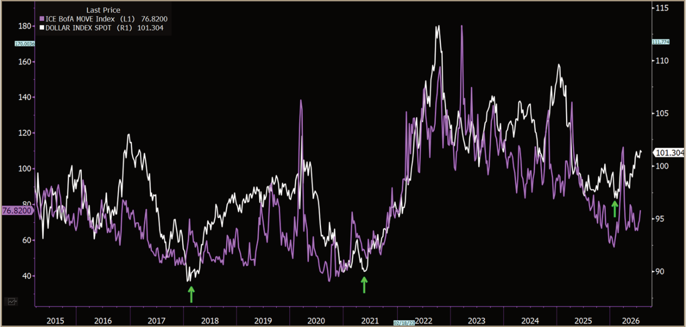
Exhibit 13 · Bond Volatility Has Not Confirmed a System-Wide Liquidity Event Source: TradingView; ICE BofA MOVE Index; Helios Analytics. Note: MOVE is a current confirmation indicator. The supplied history begins in December 2019.
The Liquidity Stress Index tells the same story. It sits close to neutral rather than in the elevated or high-stress regimes that accompanied the more disorderly episodes in the available history. The system is absorbing the current tightening without any signs of major stress. This is not a broad capitulation signal.
Source PDF · page 22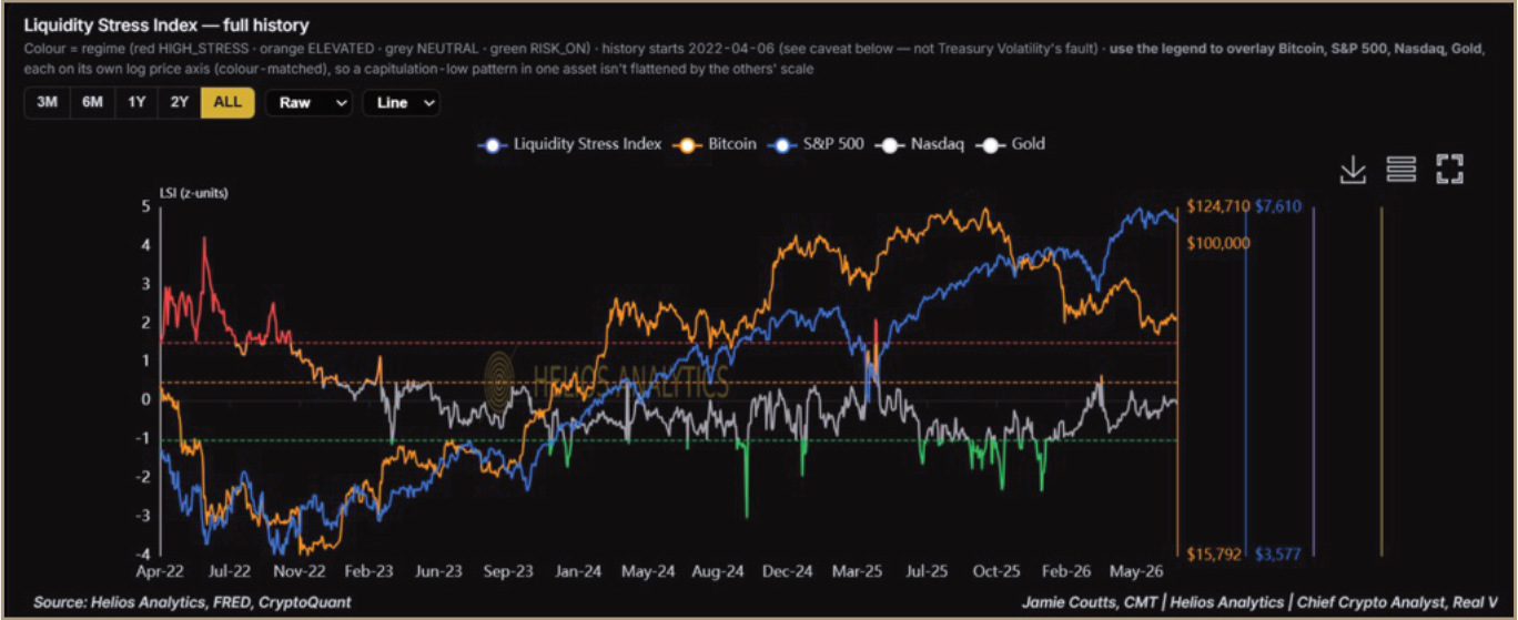
Exhibit 14 · The Liquidity Stress Index Remains Neutral Source: Helios Analytics; FRED; CryptoQuant. Note: The available index history begins in April 2022. Neutral conditions do not reverse the tightening signals from DXY and real yields.
The escalation sequence is now clear. The dollar would extend higher, real yields would maintain the breakout, Treasury volatility would rise, credit spreads would widen and market functioning would deteriorate. The first two conditions are active; the final three would confirm that the problem is spreading across the risk-asset complex.
7 · Downside Scenarios and Bitcoin Inflection
This is probably the chart that will earn me the most hate in the report. To be clear, I am not forecasting Bitcoin at $27,800. My job is to think through how the downside could develop, not just describe the outcome I would prefer.
The chart uses the only two previous real-rate breakouts that occurred while the GLI impulse was both falling and below trend: October 2018 and January 2022. Bitcoin’s median worst decline across those episodes was 33.2% within three months, 52.5% within six months and 56.5% within twelve months. Applied mechanically to Bitcoin’s price on 30 July, those drawdowns imply theoretical levels of approximately $42,700, $30,300 and $27,800.
Source PDF · page 23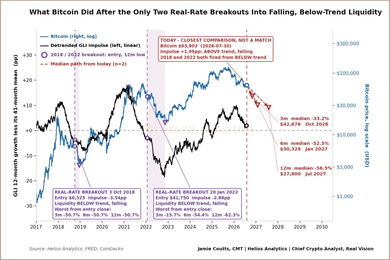
Exhibit 15 · Bitcoin Stress Scenarios Following Real-Rate Breakouts Source: Helios Analytics; FRED; CoinGecko. Note: The scenario levels apply the median worst drawdown from the October 2018 and January 2022 episodes to Bitcoin’s price on 30 July 2026. They are stress scenarios, not forecasts or fixed-horizon price targets. The historical sample contains only two observations. Unlike both prior episodes, the current GLI impulse remains above trend, although it is falling.
Two observations are nowhere near enough to establish a reliable forecasting model, and the current setup is not an exact match. Liquidity momentum is falling, but the GLI impulse remains above trend; in 2018 and 2022, it was already below trend when the real-rate signal fired. The chart is therefore a map of plausible stress, not a destination.
Still, dismissing the comparison would be equally careless. Real yields have broken higher, liquidity momentum is deteriorating and Bitcoin’s absolute trend remains bearish. The wider evidence in this report points to more downside, even if this chart cannot tell us precisely how much or when.
Source PDF · page 24Two Paths From Here
The first path is the conventional one. Bitcoin follows the historical pattern, trades materially lower and eventually produces a durable trend reversal. If that happens, the eventual entry will be determined by the trend signal.
The second path would be more important. Bitcoin could reject the historical pattern and reverse higher despite falling liquidity momentum and elevated real yields. That would suggest either that the old relationship has weakened or that a stronger structural source of demand is overwhelming the macro headwinds. The market has not provided that evidence yet. Again, the trend signal is crucial.
What Would Confirm the Inflection?
Bitcoin’s improving relative strength against gold, the Nasdaq and the S&P 500 is notable. Leadership often changes before the absolute trend turns. But relative strength can also improve simply because Bitcoin is falling more slowly. The underlying asset still has to confirm the message.
I want to see:
- Bitcoin reclaim its 160-day trend filter, currently $69,468.
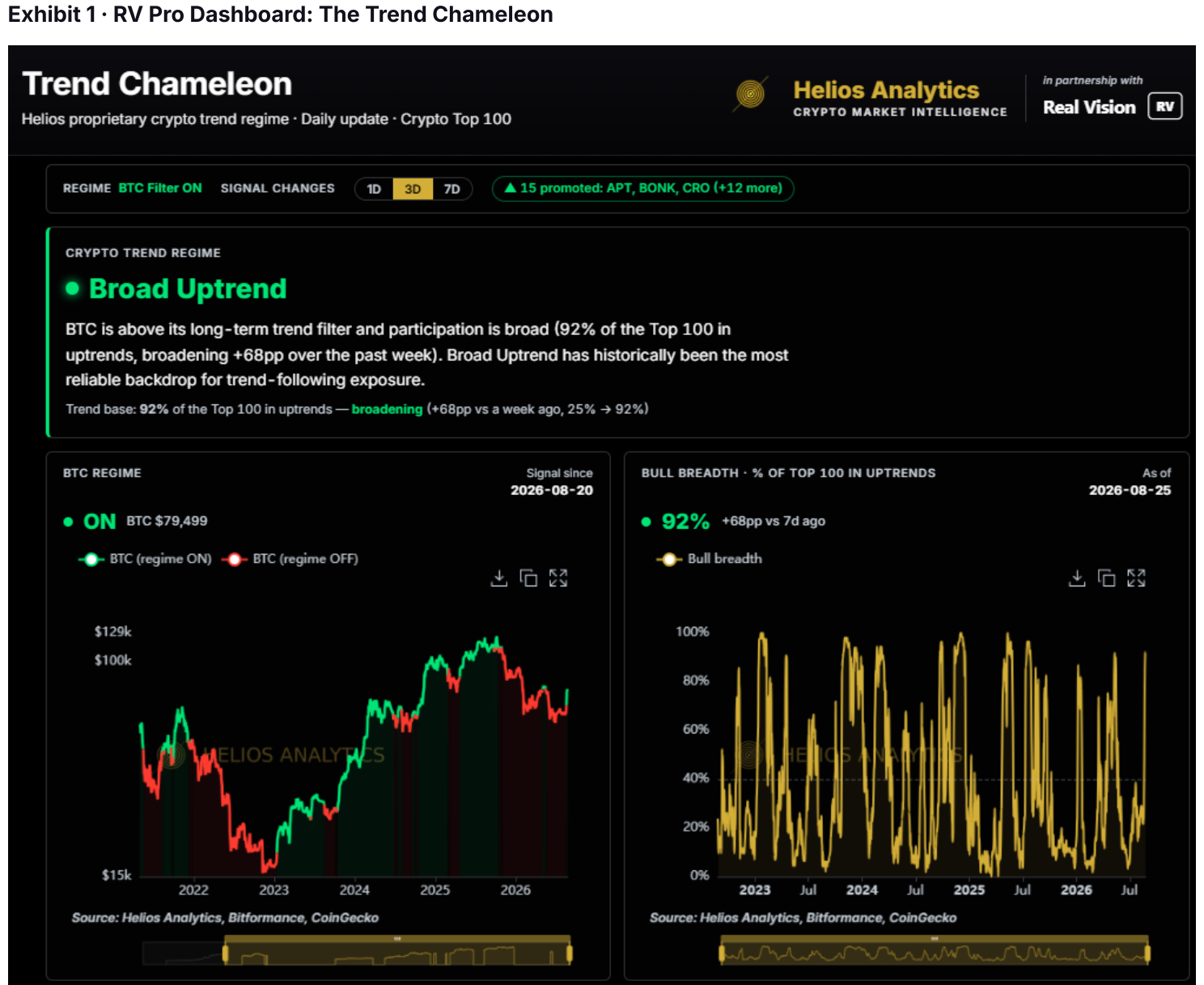
- The weekly Trend Chameleon move out of its Strong Bear state, most likely first turning yellow.
- Bitcoin’s weekly relative trends against gold, the Nasdaq and the S&P 500 confirm the improvement; all three remain in bearish regimes.
- The pressure from real yields and the dollar begin to ease.
Daily reversals are too noisy to establish a cycle turn, particularly around major inflection points. None of the absolute signals has yet reversed on a timeframe I consider reliable.
For now, the evidence is clearer on the downside risk than on the recovery. That requires portfolio changes. I will be reassessing position size, concentration and hedging while waiting for the absolute trend to confirm what the relative signals may be starting to anticipate.
Source PDF · page 25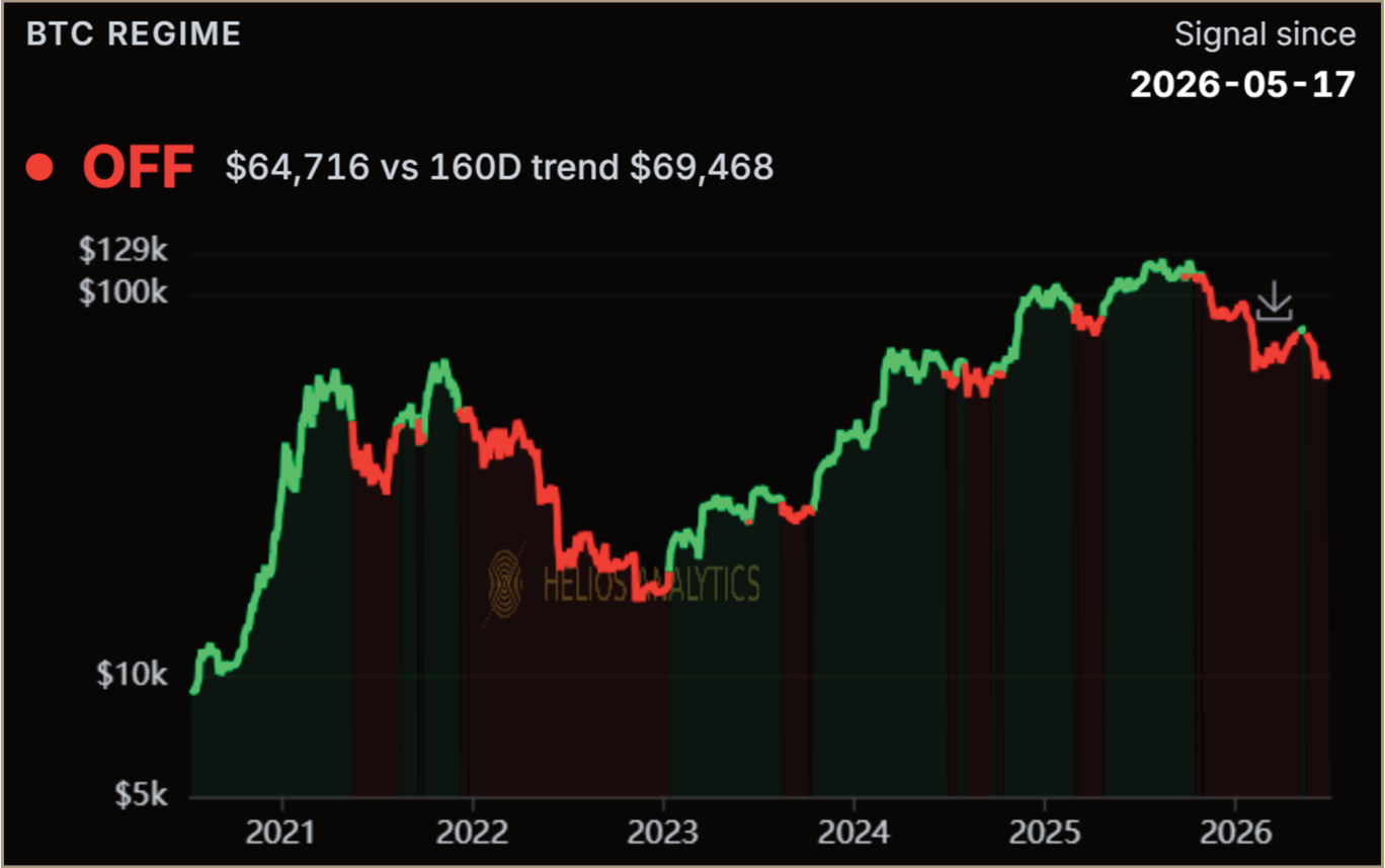
Exhibit 16 · Bitcoin Remains Below Its 160-Day Trend Filter Source: Helios Analytics. Note: The BTC Regime filter remains OFF, with Bitcoin at $64,716 versus a 160- day trend level of $69,468 at the chart date. A reclaim would be the first absolute confirmation that the downtrend is repairing; it would not, on its own, confirm a new bull cycle.
Source PDF · page 26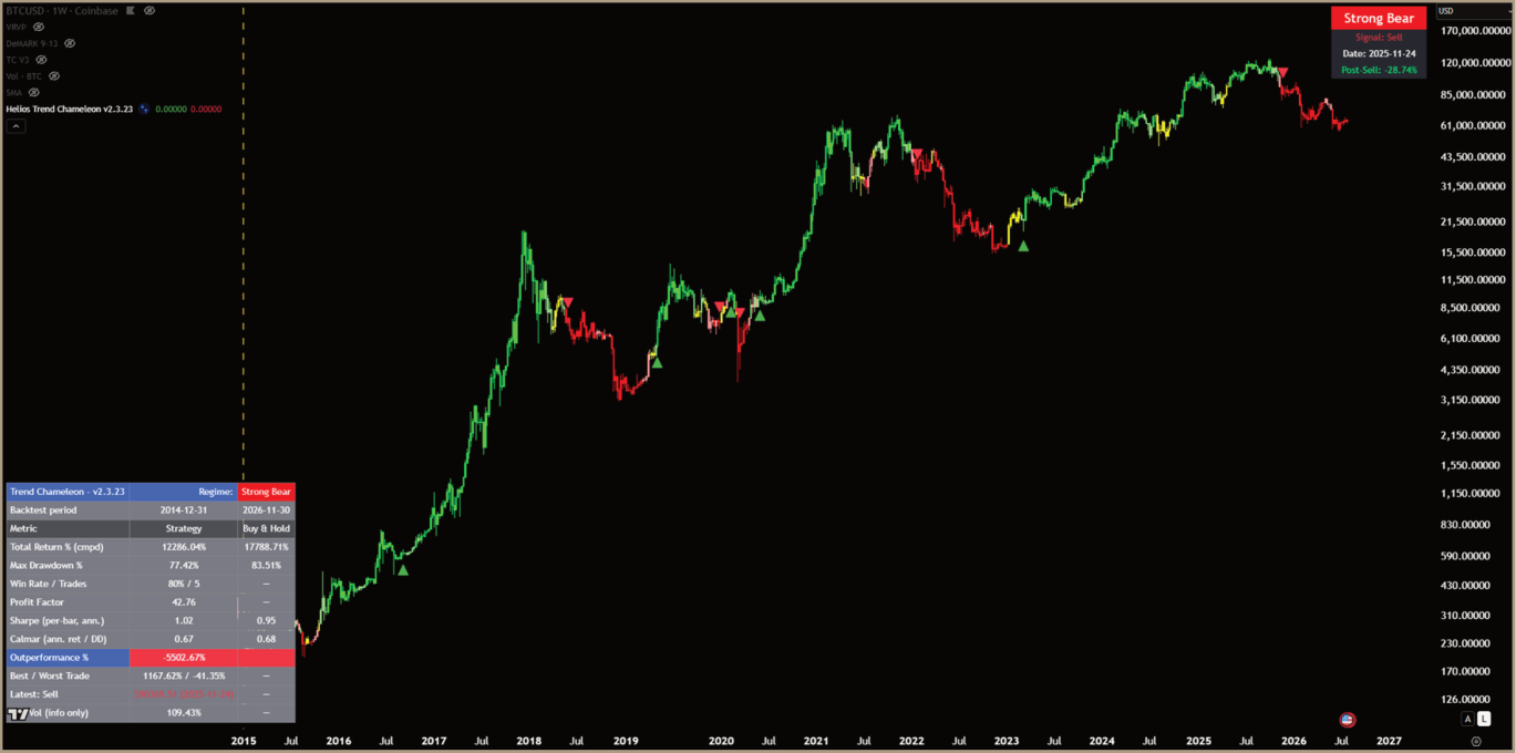
Exhibit 17 · The Weekly Trend Chameleon Remains in a Strong Bear Regime Source: TradingView; Helios Analytics. Note: The weekly Trend Chameleon remains in a Strong Bear regime following the 24 November 2025 sell signal. A move to yellow would show that downside momentum is easing, but further improvement would be needed to confirm a durable cycle turn.
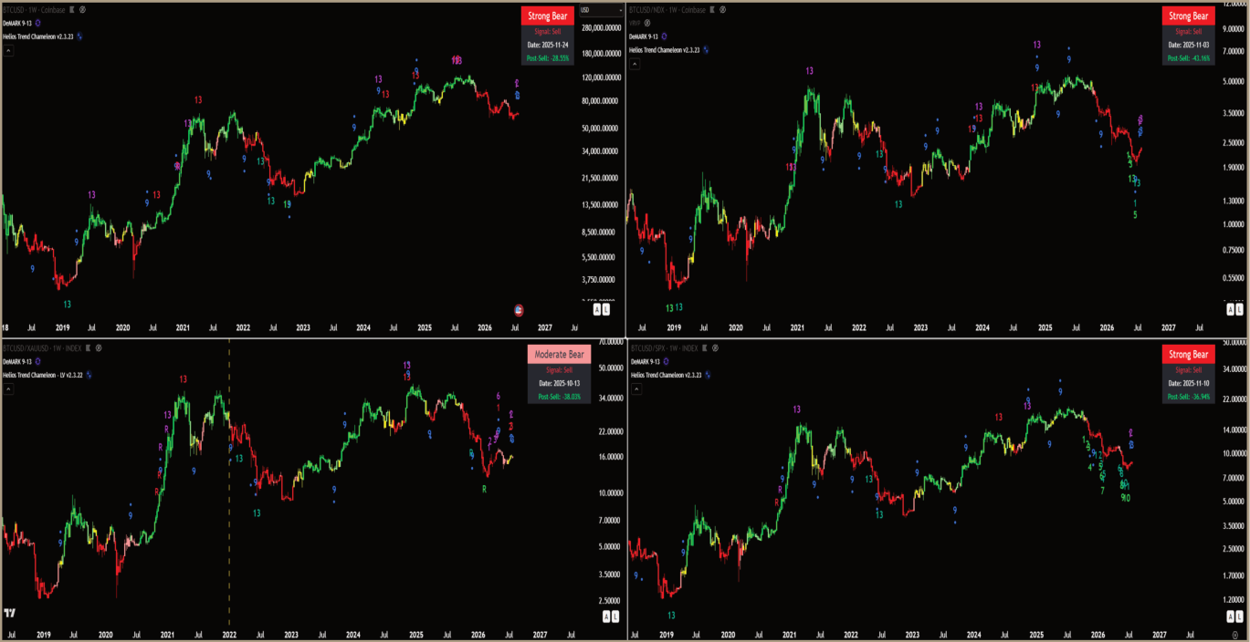
Exhibit 18 · Bitcoin’s Weekly Relative Trends Have Not Confirmed an Inflection Source: TradingView; Helios Analytics. Note: Bitcoin remains in bearish weekly Trend Chameleon regimes against gold, the Nasdaq 100 and the S&P 500. These ratios must improve alongside Bitcoin’s absolute trend; relative strength alone can rise because Bitcoin is simply falling more slowly.
Source PDF · page 278 · The Spice Must Flow
The liquidity drought is not over. Global liquidity remains near a record, but its impulse is fading, real yields have broken higher and Bitcoin remains in a bearish absolute trend. Bitcoin has already absorbed a large amount of damage; the technical evidence is not yet strong enough to conclude that the adjustment is complete.
This is still active tightening rather than a system-wide liquidity crisis. DXY and real yields are warning, while MOVE, credit spreads and the Liquidity Stress Index show that pressure has not spread far enough to disrupt the broader system. Without that stress, policymakers have little reason to act. The drought can persist, and asset prices may have to do more of the adjustment.
The sequence that would change that is clear: the dollar extends higher, real yields hold the breakout, Treasury volatility rises, credit spreads widen and funding or market functioning begins to deteriorate. That is when markets are likely to sell off more sharply, the February low becomes more vulnerable and portfolio protection matters most.
But that is also how the drought could eventually end. If stress begins to threaten funding or collateral markets, policymakers are likely to respond, initially through targeted liquidity measures and more broadly only if the disruption becomes systemic.
The growing financing burden increases the system’s sensitivity to any deterioration in investor demand, dealer capacity or funding conditions. It does not establish that the system has already reached an absorption constraint. Preferences over the size of central-bank balance sheets remain subordinate to market functioning if the funding system stops clearing cleanly.
Bitcoin is unlikely to wait for the headline liquidity data to recover. In the prior tightening cycles, it turned when the deterioration began to ease, well before the broader liquidity trough. If policy support arrives and the liquidity impulse turns, Bitcoin would likely be among the first assets to outperform. I will still wait for the 160-day filter, the weekly Trend Chameleon and the relative trends to confirm it. For now, the portfolio stays defensive. If stress eventually produces that turn, the spice will flow.
Source PDF · page 28Appendix · Constructing the Helios Global Liquidity Index
The GLI directly sums central-bank balance sheets for the US, China, Japan, euro area, UK, Switzerland, Canada, Australia, Brazil and India; broad money for the same economies, using Australian M3; and Chinese and Japanese FX reserves. It then deducts the US Treasury General Account and overnight reverse-repo balances. The components are aggregated without explicit country weights.
Non-US series are translated into US dollars at prevailing exchange rates. The US central-bank balance-sheet series uses the DXY-based normalization specified in the source model. The index is calculated daily using the latest available observation, so lower-frequency monetary releases are carried forward until updated.
Signal Definitions
The GLI stock is the aggregate dollar level. Annual growth is its 12-month percentage change. The trend benchmark is a 41-month moving average of that growth rate. The detrended impulse is 12-month growth less its 41-month trend, while momentum is the 91-day change in that detrended series. Positive momentum is rising; negative momentum is falling. Above or below trend refers to the sign of the detrended impulse.
Twelve-month growth is a standard market convention that reduces seasonal distortion across monetary series. The 41-month trend was selected through preliminary testing as a useful cycle filter. The specification remains under investigation and has not completed formal optimization or robustness testing.
Limitations
The GLI is a broad macro-liquidity proxy, not a measure of deployable capital. Dollar conversion creates mechanical FX sensitivity; mixed reporting frequencies create publication lags; historical series may be revised; and aggregating broad money, central-bank assets and reserves may introduce overlap. The index also compresses meaningful institutional differences across economies into one aggregate.
Source PDF · page 29Appendix · Real-Yield Breakout Event Ledger
Appendix Table 3 · Every Qualifying Real-Yield Breakout Since 2003
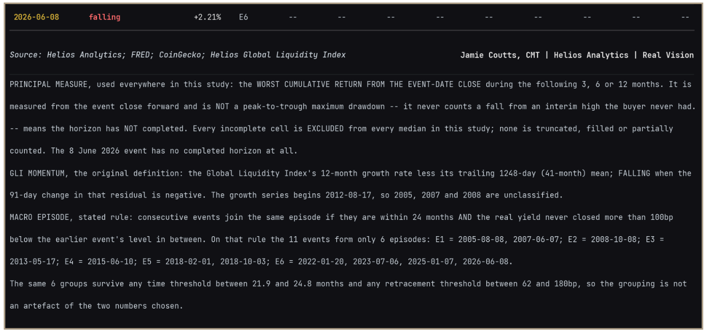
Appendix Table 3 (continued) · Measurement and Episode-Consolidation Rules
Jamie Coutts, CMT

A pioneer in crypto financial analysis and a sought-after speaker, Jamie has transitioned from traditional markets to digital assets, creating research insights for institutions assessing blockchains and digital assets as part of their strategic investment allocations. Jamie’s multi-disciplinary approach blends traditional macro, technical, and quantitative techniques with the emerging field of crypto fundamentals.
Jamie’s career started as a stockbroker in Australia before roles as an equity trader at a global macro hedge fund and equity sales in Singapore and London. In 2014, Jamie joined Bloomberg Singapore as the senior Asia Buyside equity specialist, where he later led the regional crypto/digital assets sales and product strategy before launching Bloomberg Intelligence’s crypto asset research product.
Jamie holds a business degree and two technical analysis designations, previously serving on the global board of the Chartered Markets Technician (CMT) Association, where he was also head of APAC Development. Jamie has spoken at conferences across Asia and the U.S., and his research regularly features on crypto podcasts. His content is available via the Bloomberg terminal, as well as Twitter and LinkedIn.
A passionate advocate for personal health, wellness and liberty, Jamie is committed to amplifying solutions that promote greater personal autonomy, economic freedom and decentralization.